Volume 29, Number 5—May 2023
Dispatch
Comparative Aerosol and Surface Stability of SARS-CoV-2 Variants of Concern
Figure 1
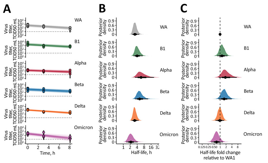
Figure 1. SARS-CoV-2 variant exponential decay in aerosolized form and corresponding half-lives. A) Regression lines representing predicted exponential decay of log10 virus titer over time compared with measured (directly inferred) virus titers. Points with black bars show individually estimated titer values (point: posterior median titer estimate; bar: 95% credible interval). Points at 3 hours and 8 hours are shifted up or down by the physical/noninactivation change in viral material estimated from quantitative reverse transcription PCR data (Appendix), to enable visual comparison with predicted decay (which reflects only inactivation effects). Semitransparent lines show random draws from the joint posterior distribution of the exponential decay rate and the drum run intercept (virus titer at t = 0); this visualizes the range of plausible decay patterns for each experimental condition. We performed 50 random draws and then plotted 1 line per draw for each drum run, yielding 300 plotted lines per variant. B) Inferred virus half-lives by variant, plotted on a logarithmic scale. Density plots show the shape of the posterior distribution. Dots show the posterior median half-life estimate and black lines show a 68% (thick) and 95% (thin) credible interval. C) Inferred ratio of variant virus half-lives to that of WA1 (fold-change), plotted on a logarithmic scale and centered on 1 (no change, dashed line). Dot shows the posterior median estimate and black lines show a 68% (thick) and 95% (thin) credible interval. TCID50, 50% tissue culture infectious dose.
1These authors contributed equally to this article.
2Current affiliation: Lovelace Biomedical Research Institute, Albuquerque, New Mexico, USA.