Volume 30, Number 10—October 2024
Research
Economic Analysis of National Program for Hepatitis C Elimination, Israel, 20231
Figure 1
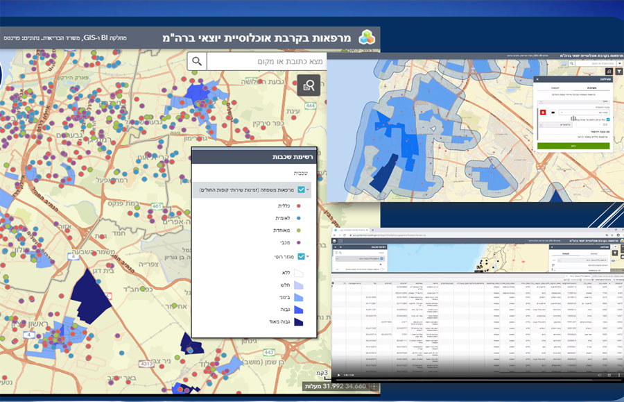
Figure 1. Geographic mapping in an economic analysis of a national program for hepatitis C elimination, Israel, 2023. Screenshot show Hebrew-language mapping by Points Location Intelligence company (https://points.co.il) in ArcGIS (www.arcgis.com). Upper right inset shows clinic locations (orange dots) at the beginning of the program. Blue shading indicates areas with higher populations of immigrants from the former Soviet Union, who are at higher risk for hepatitis C virus infection; intensity of shading increases as population numbers rise. Detail on left shows increased clinical sites added as part of the hepatitis C elimination program. Each colored dot (orange, blue, green, purple) represents a clinic and its affiliation to 1 of the 4 health maintenance organizations, shaded areas that represent the prevalence of population at risk in a given geographic area. Darker blue indicates higher concentrations of at-risk populations. Combining the 2 parameters (clinics distribution and density of population at risk density) enabled a systematic strategy for a targeted approach to identify and list clinics for higher yield in program accomplishment.
1Preliminary results from this study were presented at the Israel National Institute for Health Policy Research conference; May 31, 2023; Tel Aviv, Israel.