Skip directly to site content Skip directly to page options Skip directly to A-Z link Skip directly to A-Z link Skip directly to A-Z link

Disclaimer: Early release articles are not considered as final versions. Any changes will be reflected in the online version in the month the article is officially released.

Volume 31, Number 12—December 2025

Research Letter

Enhanced Risk for Epidemic Cholera Transmission, Haiti

Andrew J. Curtis, V. Madsen Beau De Rochars, Melody Achille, Rigan Louis, Jayakrishnan Ajayakumar, Jacques Boncy, Afsar Ali, and J. Glenn MorrisComments to Author 
Author affiliation: Case Western Reserve University, Cleveland, Ohio, USA (A.J. Curtis, J. Ajayakumar); University of Florida, Gainesville, Florida, USA (V. Madsen Beau De Rochars, R. Louis, A. Ali, J.G. Morris Jr.); Université Quisqueya, Port-au-Prince, Haiti (M. Achille); Ministère de la Santé Publique et de la Population, Port-au-Prince (J. Boncy)

Main Article

Figure

Maps showing enhanced risk for epidemic cholera transmission, Haiti. Extracted cartography are from the grid heat map disease monitoring system for Port-au-Prince during the summer surge of suspected cholera cases between the weeks ending April 20–October 13, 2025. A) April 20; B), April 27; C) May 14; D) June 1; E) June 20; F) June 29; G) August 20; H) August 20; I) October 7; J) October 13. The mapped area is identified on the August 20 map (panel H; yellow outline) for the whole country, which also shows the broader geographic spread of suspected cholera for that reporting period. The shading should be interpreted carefully because each commune is mapped according to where it falls along its own epidemiologic curve for that week. Each commune also can be compared to its neighbors in the same week by where they also fall along their curves, given that communes with the darkest shade are at their peak number of cases. The maps should not be interpreted as visualizing the actual number of cases per commune per week using the same classification scheme as one would in a typical cartographic display. Maps created by using OpenStreetMap (https://www.openstreetmap.org).

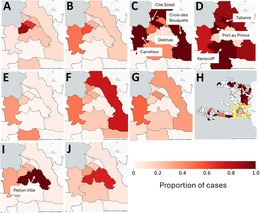
Figure. Maps showing enhanced risk for epidemic cholera transmission, Haiti. Extracted cartography are from the grid heat map disease monitoring system for Port-au-Prince during the summer surge of suspected cholera cases between the weeks ending April 20–October 13, 2025. A) April 20; B), April 27; C) May 14; D) June 1; E) June 20; F) June 29; G) August 20; H) August 20; I) October 7; J) October 13. The mapped area is identified on the August 20 map (panel H; yellow outline) for the whole country, which also shows the broader geographic spread of suspected cholera for that reporting period. The shading should be interpreted carefully because each commune is mapped according to where it falls along its own epidemiologic curve for that week. Each commune also can be compared to its neighbors in the same week by where they also fall along their curves, given that communes with the darkest shade are at their peak number of cases. The maps should not be interpreted as visualizing the actual number of cases per commune per week using the same classification scheme as one would in a typical cartographic display. Maps created by using OpenStreetMap (https://www.openstreetmap.org).

Main Article

Page created: December 09, 2025
Page updated: December 23, 2025
Page reviewed: December 23, 2025
The conclusions, findings, and opinions expressed by authors contributing to this journal do not necessarily reflect the official position of the U.S. Department of Health and Human Services, the Public Health Service, the Centers for Disease Control and Prevention, or the authors' affiliated institutions. Use of trade names is for identification only and does not imply endorsement by any of the groups named above.
file_external