Volume 19, Number 1—January 2013
Research
Automated Biosurveillance Data from England and Wales, 1991–2011
Doyo G. Enki, Angela Noufaily, Paul H. Garthwaite, Nick J. Andrews, André Charlett, Chris Lane, and C. Paddy Farrington
Figure 6
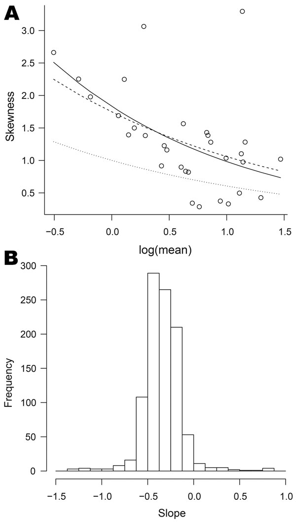
Figure 6. . Relationships between mean and skewness for data on organisms collected, England and Wales, 1991–2011. A) Skewness plotted against log of mean for Cyclospora spp. The full curve is the best fit to the points; the dashed curve corresponds to the negative binomial model; the dotted curve corresponds to the Poisson model. B) Histogram of the parameters corresponding to the best-fit curves for 1,001 organisms; the value −0.5 corresponds to the negative binomial model (equation 2).
Page created: December 20, 2012
Page updated: December 20, 2012
Page reviewed: December 20, 2012
The conclusions, findings, and opinions expressed by authors contributing to this journal do not necessarily reflect the official position of the U.S. Department of Health and Human Services, the Public Health Service, the Centers for Disease Control and Prevention, or the authors' affiliated institutions. Use of trade names is for identification only and does not imply endorsement by any of the groups named above.