Coronavirus Disease Model to Inform Transmission-Reducing Measures and Health System Preparedness, Australia
Robert Moss, James Wood, Damien Brown, Freya M. Shearer, Andrew J. Black, Kathryn Glass, Allen C. Cheng, James M. McCaw, and Jodie McVernon

Author affiliations: The University of Melbourne, Melbourne, Victoria, Australia (R. Moss, F.M. Shearer, J.M. McCaw, J. McVernon); University of New South Wales, Sydney, New South Wales, Australia (J. Wood); The Peter Doherty Institute for Infection and Immunity at the University of Melbourne and Royal Melbourne Hospital, Melbourne (D. Brown, J.M. McCaw, J. McVernon); University of Adelaide, Adelaide, South Australia, Australia (A.J. Black); Australian National University, Canberra, New South Wales, Australia (K. Glass); Monash University, Melbourne (A.C. Cheng); Murdoch Children’s Research Institute, Melbourne (J. McVernon)
Main Article
Figure 7
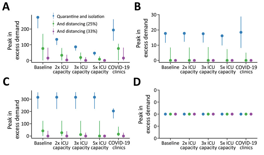
Figure 7. Estimated peak excess demand for healthcare sector services, expressed as percent available capacity, compared with quarantine and isolation scenarios during the COVID-19 epidemic, Australia. The graphs compare exceedance for COVID-19 admissions for A) ICU beds; B) hospital ward beds; C) emergency departments; and D) general practitioner services at baseline, 2×, 3×, and 5× ICU capacity. Blue lines indicate quarantine and isolation only scenarios; green lines indicate overlaid social distancing measures that reduce transmission by an additional 25%; and purple lines indicate overlaid social distancing measures that reduce transmission by an additional 33%. The COVID-19 clinics scenario reflects an alternative triage pathway, and baseline capacity. Dots denote the median; lines range from 5th–95th percentiles of simulations. COVID-19, coronavirus disease; ICU, intensive care unit.
Main Article
Page created: September 24, 2020
Page updated: November 19, 2020
Page reviewed: November 19, 2020
The conclusions, findings, and opinions expressed by authors contributing to this journal do not necessarily reflect the official position of the U.S. Department of Health and Human Services, the Public Health Service, the Centers for Disease Control and Prevention, or the authors' affiliated institutions. Use of trade names is for identification only and does not imply endorsement by any of the groups named above.